Product metrics that matter in 2026
Introduction
Every product team has dashboards packed with charts, percentages, funnels, and trend lines. Yet the big questions remain unanswered: What truly moved the product forward this week? Why did users behave differently? Which change actually mattered?
The problem often begins with volume. When everything is measured, nothing stands out. Teams chase spikes, celebrate lifts, and add new reports, but the signal gets lost in the noise. This guide shows how to identify those metrics, track them with purpose, and turn them into faster, sharper product decisions.
What are product metrics?
Before choosing better product metrics, teams need a shared understanding of what a product metric actually represents. Many teams track numbers diligently yet mix concepts that serve very different purposes, and this confusion is often where prioritisation begins to break down.
Product metrics explain how users experience and interact with the product. They help teams understand behavior, value delivery, and progress over time. They are not meant to replace business reporting or goal-setting frameworks. They exist to inform product decisions. Let’s break this down.
Product metrics vs. business metrics
Product metrics focus on how the product is used. Business metrics focus on what the business earns or spends. Both matter, but they answer different questions.
- Product metrics include signals such as feature adoption, activation rate, time to first value, and task completion success. These metrics help product teams understand whether users are finding value and where friction exists.
- Business metrics include revenue, churn, customer acquisition cost, and lifetime value. These metrics help leadership understand financial health and growth.
Problems arise when teams mix the two. For example, prioritizing features solely by revenue impact can lead teams to overlook usability issues that block adoption. On the other hand, optimizing usage without understanding the business impact can lead to busywork.
In 2026, strong product teams use product metrics to guide what to build, and business metrics to validate why it matters.
Metrics vs. KPIs vs. OKRs
These terms are often used interchangeably, creating confusion in planning and reviews. Product metrics are signals. They describe behavior or outcomes—for example, weekly active users on a feature or the average time to complete a workflow.
- KPIs are focus points. They highlight which metrics matter most right now. A KPI is usually a small subset of product metrics tied to a specific priority.
- OKRs provide direction. Objectives describe what the team wants to achieve. Key results use metrics or KPIs to measure progress toward that objective.
In practice, they work best together. Product metrics feed KPIs. KPIs support key results. OKRs provide context so teams know which metrics deserve attention in a given cycle.
3. Vanity metrics vs. actionable metrics
Vanity metrics look impressive, but rarely change decisions. Actionable product metrics create clarity and prompt action. In 2026, actionable metrics tend to share three traits: they relate to specific user behavior, respond meaningfully when teams ship improvements, and help teams decide what to do next.
A simple gut-check product managers can apply is this: if the metric moves tomorrow, would the team know why it happened and what to do about it? If the answer is unclear, the metric is likely adding noise. The goal is not to track fewer metrics for the sake of simplicity, but to track product metrics that genuinely guide prioritisation, experimentation, and product decisions.
Building a metrics system that gives your product a clear direction
Every product team wants better metrics, but most skip the step that gives those metrics meaning: choosing a single direction that everything else supports. When teams track too many metrics without a shared anchor, decisions start to drift. Some optimise activation, others chase retention, others run experiments that never connect back to value.
A strong metrics system begins with one idea of success. This isn’t about simplifying for the sake of simplicity. It creates alignment, reduces noise, and helps the team understand whether their work is actually moving the product forward.
That anchor is the north star metric.
1. What a good north star metric looks like
A north star works only when it captures the essence of why users choose your product. Rather than mirroring revenue targets or operational goals, it should point to a moment where users clearly experience value. Think of it like a heartbeat: When the north star moves, something meaningful has happened inside the product.
A strong north star usually:
- Represents real user value: It reflects a behavior users find meaningful, such as completing a workflow or collaborating with teammates.
- Repeats often enough to guide decisions: When the signal comes frequently, teams can run experiments and see the impact quickly.
- Scales as the product grows: It should remain relevant whether the product has 100 users or 10,000 teams.
The north star is not a vanity number. It is the product’s definition of success and becomes the reference point for every metric that follows.
2. Input metrics, outcome metrics, and guardrails
After setting the north star, teams layer supporting metrics around it. This structure prevents the team from over-focusing on one chart and missing the rest of the story.
- Input metrics explain what drives the north star upward. These measure early behaviors that show whether users are progressing toward value. For example, activation, onboarding completion, or adoption of core features. When input metrics stagnate, the north star usually follows.
- Outcome metrics reflect the long-term value to users. Retention, repeat usage, or expansion are strong signals of sustained success. These metrics confirm whether users stayed, grew, or deepened their engagement.
- Guardrail metrics protect the product. As teams experiment and optimise, guardrails ensure value does not come at the cost of reliability or experience. A drop in stability, a spike in support tickets, or delays in loading times all reveal risk before it becomes churn.
Together, these three layers create a complete picture. The north star sets direction. Input metrics show momentum. Outcome metrics validate impact. Guardrails maintain quality.
Example: A north star for a modern B2B product
Imagine a collaborative B2B product used by teams to plan and deliver work. A practical north star could be: “Weekly active teams completing their core workflow successfully.”
This captures genuine value: active teams, real collaboration, and successful outcomes.
Now, the supporting structure might look like this:
Input metrics
- New teams reaching activation within the first three days
- Onboarding flow completion
- First use of the core workflow feature
These show whether users can get started and reach value moments quickly.
Outcome metrics
- Team retention after 30, 60, and 90 days
- Number of workflows completed per team per week
- Expansion through additional seats or new workspaces
These confirm whether teams find ongoing value in the product and grow with it.
Guardrails
- Workflow error rates
- Increase in support tickets linked to workflow steps
- Drop in consistency of weekly usage
These protect the product from hidden issues that may undermine long-term health.
This structure helps everyone on the team see how their work contributes to a single direction. It removes guesswork, simplifies discussions, and ensures that the metrics being tracked actually serve the product’s goals.
The 2026 metrics map: Track metrics by the user journey
Most teams collect product metrics in isolation. Activation is tracked separately from onboarding, engagement lives on another dashboard, and churn shows up only after it is too late to change anything. The most reliable way to understand product performance in 2026 is to map metrics to the user journey. This mirrors how value is created inside the product and gives teams a clear way to diagnose what is working, what is stuck, and where users fall through. Each stage answers a different question about the product's health.
1. Acquisition metrics: Are the right users entering?
Acquisition metrics measure the quality of users entering the product. Strong acquisition is not about high traffic or large signup counts; it is about attracting users who match your ICP and are likely to reach value.
Useful metrics include:
- Signup conversion rate for core channels
- ICP signup share, which shows whether the right audience is coming in
- CAC, especially when paid channels are part of the strategy
Healthy acquisition creates a base of users who are a genuine fit for the product. Poor acquisition creates noise that impacts activation, retention, and adoption downstream.
2. Activation metrics: Do users reach value quickly?
Activation is one of the most important product metrics that matter in 2026. It represents the moment a user first experiences the product’s value. Activation is not a click or a signup. It is a behavioral milestone that proves a user understood the product and used it meaningfully.
Key activation signals include:
- Activation rate, tied to a clear value moment
- Time to value (TTV), which measures how long it takes a user to reach that moment
- Activation quality, which checks whether users who activate also go on to retain
Fast, consistent activation strengthens the entire user journey. Slow or unclear activation creates friction that compounds over time.
3. Onboarding metrics: Can users get started without friction?
Onboarding sets the tone for the user’s long-term relationship with the product. Even a strong acquisition and activation cannot compensate for a confusing or incomplete onboarding experience.
Important onboarding metrics include:
- Setup completion rate for the first workflow
- Onboarding drop-off at each step of the funnel
- Support tickets raised by new users, which often reveal hidden usability issues
High-performing teams treat onboarding as a product within the product. The goal is not only to inform but to guide users toward value with as little friction as possible.
4. Engagement metrics: Are users building a habit?
Engagement shows whether users return to the product and interact with it frequently enough to form habits. These metrics reflect day-to-day product value.
Examples include:
- DAU and MAU, which give a sense of activity volume
- Stickiness (DAU/MAU ratio), which highlights the depth of engagement
- The frequency of core actions often tells a clearer story than raw usage numbers
Engagement metrics are powerful, but they can mislead when interpreted without context. A rising DAU may look positive, yet a deeper check might reveal that only one feature is being used while others remain untouched. This is why engagement should always be paired with adoption and retention signals.
5. Adoption metrics: Are key features actually being used?
Adoption metrics show whether users are embracing the features that deliver core value. Engagement alone does not guarantee adoption. A user may log in daily without using the feature that differentiates your product.
Adoption metrics include:
- Feature adoption rate, defined clearly for each feature
- Breadth vs. depth of usage, which shows how many features are used and how frequently
- Adoption by segment, which reveals which roles, team sizes or industries derive the most value
Adoption is closely tied to successful roadmap decisions. It tells teams what to double down on, what to refine, and what to deprioritise.
6. Retention metrics: Do users keep coming back?
Retention is one of the strongest indicators of product-market fit. A product that retains users reliably does not have to rely heavily on acquisition to grow. Retention metrics tell you whether users continue experiencing value over time.
Important retention signals include:
- Cohort retention, which compares users over equal time windows
- Retention by feature, which reveals which behaviors keep users engaged
- Churn rate, a fundamental measure of long-term product health
Strong retention is the natural outcome of successful activation, onboarding, and adoption. Weak retention indicates that something in the journey is breaking after the initial value.
7. Churn risk metrics: Can you spot problems early?
Churn shows up at the end of the user journey, but its causes appear far earlier. Modern product teams rely on churn risk metrics to identify problems before users leave.
Early warning signals include:
- Declining frequency of core actions
- Drop in seat usage within a team
- Reduced engagement across key features
- Negative shifts in qualitative feedback
These metrics allow teams to intervene early, adjust the product experience, and design targeted retention programs.
Monetization metrics product teams should understand
Revenue outcomes are a natural result of a healthy product, but they are not the starting point for understanding product performance. Monetization metrics help teams see whether users progress from value to willingness to pay and whether existing customers continue to find deeper value over time. The key is to interpret these metrics through a product lens, not a financial one.
1. Conversion metrics: Free to paid or trial to paid
Conversion metrics show how effectively a product moves users from initial value to sustained value. While pricing, packaging, and marketing influence these numbers, product teams have more impact than they often realise.
When activation improves, conversion improves.
When onboarding becomes clearer, conversion improves.
When core features deliver value consistently, conversion improves.
Useful conversion signals include:
- Trial to paid conversion rate
- Free to paid upgrade rate
- Conversion by segment, which reveals where product value lands strongest
These metrics tell product teams whether first-value moments translate into long-term commitment. They are not just commercial indicators; they validate the strength of early product experience.
2. Revenue context metrics: ARPU and MRR growth
ARPU (average revenue per user) and MRR growth offer a broader view of how value scales financially. These metrics help place product performance in the broader business context without requiring product teams to become revenue analysts.
- ARPU helps teams understand whether new users match the right profile and whether packaging supports value.
- MRR growth helps teams assess whether the product is expanding among both new and retained customers.
The product team's role is not to optimise revenue directly. It is to understand which product behaviors contribute to stronger financial outcomes and to ensure those behaviors are reinforced. Revenue is a reflection of value delivered, not a target to chase in isolation.
3. Expansion metrics: Are existing users getting more value?
Expansion is one of the clearest indicators that a product continues to grow with the customer. When teams use the product more deeply, add seats or adopt new modules, it reflects increasing trust and value.
Key expansion signals include:
- Net dollar retention (NDR), which captures how revenue grows or contracts within existing accounts
- Expansion MRR, which shows new revenue from additional seats or upgrades
- Feature-level expansion, which highlights which parts of the product encourage growth
Strong expansion often comes from solving a broader, more complex version of the same problem that a customer already trusts the product to address. These metrics give product teams a lens into which workflows are becoming indispensable and where opportunities for deeper value creation lie.
Customer value metrics: What users say vs. what they do
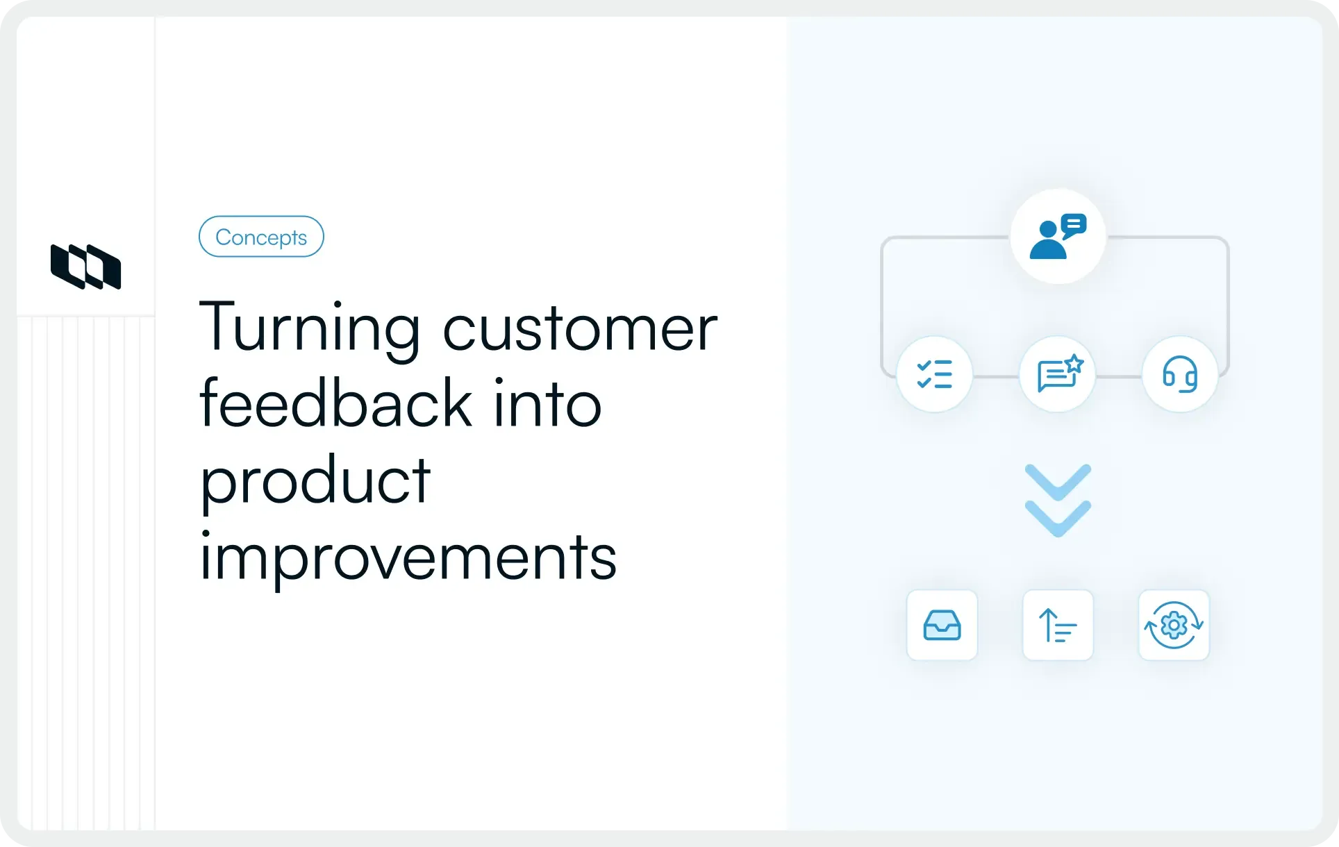
Understanding customer value requires more than reviewing dashboards or reading support tickets. In 2026, the strongest signals come from combining two perspectives: what users say and what users do. Each offers an incomplete picture on its own. Behavior shows truth. Words reveal intent, emotion, and friction. When both are analysed together, teams gain a clearer view of whether the product is genuinely solving problems.
1. NPS and CSAT: When they help and when they don’t
NPS and CSAT remain two of the most widely used customer value metrics, yet they are also two of the most misinterpreted.
When they help
- They highlight sentiment trends over time.
- They reveal whether major releases improve or weaken perception.
- They help segment feedback by user type, plan or workflow.
When they don’t
- They overrepresent extreme experiences from very happy or very unhappy users.
- They mask behavioral truth. A high NPS does not guarantee retention, and a low NPS does not always predict churn.
- They often reflect the experience of a moment rather than the full journey.
These metrics become useful only when paired with behavioral signals. A drop in NPS is meaningful when matched with a drop in feature usage or an increase in onboarding friction. Without context, sentiment scores can mislead teams into chasing emotional spikes rather than long-term value improvements.
2. Turning feedback into measurable signals
Raw feedback is noisy and subjective. The power of customer value analysis lies in converting repeated patterns into measurable, trackable signals.
Effective approaches include:
- Clustering feedback by theme, such as “setup friction”, “reporting gaps”, or “collaboration clarity”.
- Connecting themes to product behavior, for example, linking complaints about confusion to onboarding drop-offs.
- Tracking frequency over time to understand whether pain points are intensifying, shrinking, or staying constant.
When qualitative feedback aligns with quantitative behavior, it becomes one of the strongest indicators of where the product should evolve next. This balance ensures product decisions are both empathetic and evidence-based, closing the gap between what users express and what they actually do inside the product.
Delivery and product ops metrics that matter in 2026
Shipping quickly is no longer impressive on its own. Modern product teams balance speed with trust. They focus on how quickly value reaches users and how reliably it holds up in real-world use. Delivery and product operations metrics help teams understand whether their execution pace strengthens the product experience or quietly erodes it.
1. Time to market and iteration speed
Time to market and iteration speed show how efficiently a team moves from idea to delivered functionality. Faster cycles allow teams to test assumptions, reduce uncertainty, and learn from users sooner. But speed alone does not create impact.
A feature shipped in a week means little if users cannot adopt it or if the experience misses the problem entirely. High iteration speed only becomes meaningful when it connects to activation, adoption or retention improvements.
The strongest teams measure:
- Cycle time from idea to production
- Time between iterations on the same feature
- Impact of the release on core product metrics
This creates a healthy loop where speed fuels outcomes rather than vanity.
2. Quality guardrails
Every release introduces risk. Teams that scale sustainably treat quality signals as part of their product metrics, not as engineering-only concerns. Guardrails help teams move fast without eroding trust.
Useful guardrail metrics include:
- Bug frequency and severity, which reveal stability issues early
- Incident volume and time to resolution, which highlight systemic problems
- Support ticket load, which often exposes usability gaps
- Regression issues triggered by new releases
These signals protect the product from hidden friction. A spike in support volume, for example, is often an early indicator that onboarding or feature clarity has deteriorated. Guardrails ensure that growth and reliability rise together.
3. Connecting releases to outcomes
A release is successful only when it moves a meaningful metric. Producing release notes and shipping features is the easy part. The real work begins after launch, when teams examine whether user behavior actually changed.
Teams can build this habit by consistently reviewing:
- Feature adoption rates after the release
- Changes in activation or time to value
- Retention shifts within affected segments
- Qualitative feedback linked to the release
This closes the loop between planning, building, shipping and learning. Instead of optimising for output, teams optimise for outcomes, which is the core of modern product operations.
Metrics frameworks that help you choose faster
Even with a strong understanding of product metrics, choosing what to measure can feel overwhelming. Frameworks help simplify this decision. They offer a structured way to think about user behavior, product value and focus areas. They are not rigid rules. Their real purpose is to create clarity when the team needs direction.
Below are two approaches that modern product teams use: one classic and one far more adaptable to everyday product work.
The AARRR metrics framework
AARRR stands for Acquisition, Activation, Retention, Revenue and Referral. It became popular because it compresses the entire user lifecycle into a simple, memorable structure.
When AARRR is useful
- When the goal is to understand the full customer journey at a high level
- When teams want a clean starting point for selecting funnel-based metrics
- When early-stage products need clarity on where drop-offs happen
It gives a broad map of how users discover, experience and deepen their relationship with a product. For teams with limited data maturity or unclear metric definitions, AARRR creates a much-needed foundation.
When AARRR is not useful
- When a product has complex, non-linear workflows (common in B2B tools)
- When teams need depth rather than simplicity
- When features have multiple value moments, not a single activation point
In these cases, AARRR can oversimplify the product experience and obscure the nuances that matter for decision-making.
A simpler alternative: North star + journey metrics
Most modern B2B teams find more value in a clearer, more flexible approach: combining a north star metric with user journey metrics.
This structure works because it connects the big picture to actionable signals. The north star defines success. Journey metrics reveal whether users are progressing toward that success at each stage: acquisition, activation, onboarding, engagement, adoption, and retention.
Why this approach fits most teams in 2026:
- It stays grounded in real behavior inside the product
- It adapts to changing features and user roles
- It scales from early prototypes to enterprise-ready products
- It avoids the trap of tracking too many KPIs at once
This framework does not require memorising five steps or retrofitting your product into a fixed model. It mirrors how users actually interact with the product, making it easier for teams to diagnose issues and choose metrics that matter.
How to choose the right product metrics for your stage
No single set of product metrics works for every team. The right metrics depend on the product’s maturity, the clarity of its value proposition and the predictability of user behavior. Choosing metrics stage-by-stage keeps teams focused on what matters now instead of chasing signals that belong further down the road.
1. Early-stage products
Early-stage teams operate in uncertainty. The core question at this stage is simple: Do users understand the product and reach value quickly? This is why early-stage products perform best when they focus on the first half of the user journey.
Key metrics include:
- Activation rate tied to a clear value moment
- Time to value, which reflects onboarding clarity
- Onboarding completion and early friction points
- First feature adoption, especially for the core workflow
Retention matters, but only as a directional signal. At this stage, retention improves when activation improves. The goal is to create a consistently repeatable path to value before optimising anything else.
2. Growing products
Growing products have a repeatable value engine. Users activate predictably and understand the core workflow. The focus now shifts to strengthening engagement and expanding value across more scenarios.
Key metrics include:
- Feature adoption depth, not just usage frequency
- Retention by cohort, to understand long-term stickiness
- Expansion signals, especially additional seats or new use cases
- Engagement frequency, particularly around behaviors that match the north star
Teams at this stage benefit from segmenting metrics by user role, company size, or industry. Patterns become clearer, and product decisions become more targeted. Growth hinges on understanding which users thrive and which ones fade, then adjusting the product experience accordingly.
3. Mature products
Mature products serve multiple user types, power more complex workflows, and face higher expectations around stability and performance. At this stage, teams optimise for efficiency, reliability, and depth of value.
Important metrics include:
- NDR and expansion MRR, which show account-level growth
- Workflow success rate, reflecting stability and predictability
- Support load per account is an early stress indicator
- Quality guardrails, including bug severity, incident impact, and regression rates
- Adoption of advanced or premium features, which supports both retention and expansion
Retention remains essential, but the story becomes more nuanced. Mature products succeed when they continue to deliver value consistently while deepening their footprint within organizations.
Conclusion
Modern product teams have access to more data than ever, yet the teams that consistently make great decisions rely on fewer metrics, not more. They choose signals that reflect real user value, map clearly to the user journey, and align every experiment, release, and improvement to a shared direction. The product metrics that matter in 2026 are the ones that help teams understand progress, risk, and opportunity with precision. A good metrics system reduces noise. It highlights the behaviors that produce long-term retention, stronger activation, and deeper adoption. It connects delivery speed with product outcomes. It guides teams toward value, not vanity.
When metrics become simpler, decisions become sharper, and when decisions become sharper, products get better faster.
Frequently asked questions
Q1. What is a KPI for a product?
A KPI (key performance indicator) is a small set of product metrics that define success for a specific period. KPIs help teams track whether the product is delivering value, improving activation, strengthening retention, or supporting a strategic objective. Unlike general metrics, KPIs represent the numbers that matter most right now.
Q2. What are metrics and examples?
Metrics are measurements that describe how users interact with the product or how the product performs. Examples include activation rate, feature adoption, time to value, retention, churn rate, and workflow success rate. Metrics provide visibility into behavior and outcomes, enabling teams to make informed decisions.
Q3. What is an example of a product measurement?
A clear example is activation rate: the percentage of new users who reach their first meaningful value moment. It shows whether onboarding, guidance, and product design help users understand the product quickly. If activation improves, adoption and retention typically follow.
Q4. What is the product metrics framework?
A product metrics framework is a structured way to select and organise metrics so they support decision-making. A common approach in 2026 is north star + journey metrics, where the north star defines success, and the user journey metrics (acquisition, activation, onboarding, engagement, adoption, and retention) diagnose where value flows smoothly and where it breaks.
Q5. What are the 5 C’s of product management?
The 5 C’s are a simple way to understand core responsibilities in product management:
- Customer (understand needs),
- Context (market and ecosystem),
- Competition (differentiation),
- Company (goals and constraints) and
- Collaboration (working across teams).
These guide how PMs frame decisions, prioritise work, and align stakeholders.
Recommended for you