How to use dashboards to spot bottlenecks early
Introduction
Every team has felt that moment when delivery slows, and no one can point to a single cause. Work is moving, but not fast enough. The real issue is usually hidden: a step that takes too long or a workload imbalance that isn’t obvious from day to day.
Dashboards serve as an early warning system for these issues. They show where tasks are piling up, who is overloaded, and where flow is breaking down. In this guide, we’ll cover how bottlenecks form and how dashboards help you spot them before they become problems.
What is a project bottleneck?
A project bottleneck is any point in your workflow where work slows down, piles up, or waits longer than it should. It’s the moment when the system’s flow can’t keep up with the volume of work moving through it.
If you’re exploring how teams improve delivery flow, you may find our guide on the science of estimation: story points vs. time tracking helpful, as it breaks down how better estimation reduces surprise delays.
Where bottlenecks usually appear
Bottlenecks form when one stage of the workflow processes works more slowly than the stages before or after it. Common patterns include:
- Tasks queuing in a review or approval stage
- Dependencies waiting on one person or one role
- Unclear ownership during handoffs
- Repeated back-and-forth because the requirements aren’t clear
These slowdowns often start small, a few stuck tasks, a handoff delay, but they quickly affect the rest of the system.
Why do bottlenecks happen?
Most bottlenecks are caused by the structure of the workflow, not individual performance. Typical causes include:
- Approval delays or long review cycles
- Unclear or incomplete requirements
- Manual steps that take longer than expected
- Specialized roles with limited capacity
- Undefined priorities that stall progress
When one step can’t absorb incoming work at the same rate, tasks begin to stack up.
Why spotting bottlenecks early matters
A slight delay at one stage can ripple through the entire project. Bottlenecks:
- Slow down delivery timelines
- Increase context switching and frustration
- Reduce predictability and make planning harder
- Push teams into reactive decision-making
Early detection gives teams more time to respond before a single stuck stage turns into a systemic slowdown. Dashboards make these early signals visible long before anyone “feels” the delay.
Why bottlenecks are so dangerous
A bottleneck rarely slows down only one task. It slows everything connected to it. Because most project work is dependent or sequential, one delayed step can create a chain of delays that grows quickly over time.
Here’s how bottlenecks impact teams and delivery:
1. Slower completion times
When tasks queue up in a single stage, the whole delivery timeline stretches. Lead times increase, plans shift, and teams lose the predictability they rely on for sprint planning or roadmap commitments.
2. More frustration and context switching
Blocked work forces people to pause, pick up something else, and constantly switch contexts. This breaks focus, reduces momentum, and creates frustration, not because teams lack effort, but because progress depends on a stuck step.
3. Higher risk to deadlines and project stability
Unresolved bottlenecks compound over time. What begins as a slight delay turns into missed milestones, quality risks, and last-minute scrambling. When flow becomes unpredictable, teams move from proactive planning to reactive decision-making.
Keeping bottlenecks small and short-lived is essential for maintaining delivery speed and team stability.
If visibility issues are slowing your team down, you might like our guide on how to run effective backlog refinement meetings.
Why dashboards are no longer optional
Modern projects move quickly, involve multiple handoffs, and generate information across tools and channels. Without a clear view of how work flows, bottlenecks remain hidden until they cause real delays. Dashboards close this visibility gap.
1. Work moves fast, and information scatters
Updates live in chats, docs, tickets, and meetings. Teams often sense slowdowns before they can point to exactly where they’re happening. Dashboards pull these signals into one place, giving everyone the same view of reality.
2. Manual updates can’t keep up
Status reports and check-ins are always delayed. By the time someone notices a slowdown, it has usually already spread. Dashboards replace guesswork with real-time flow data.
3. Dashboards surface friction early
Flow metrics, WIP levels, wait times, and stage-level trends make it clear where work is piling up or slowing down. This helps teams act before deadlines, or quality is affected.
4. Teams avoid last-minute surprises
When dashboards become part of the daily rhythm, bottlenecks stop being unexpected. Teams stay ahead of delays, rebalance workloads faster, and maintain a steadier delivery pace, even in fast-moving or cross-functional environments.
Different dashboard views for different audiences
The same dashboard doesn’t serve everyone equally. Different roles need different layers of visibility to keep work moving. Tailoring dashboard views ensures each group sees signals that matter to them, without noise.
For individual contributors
ICs need a clear picture of what’s on their plate today and what’s at risk of getting stuck.
- Work in progress (WIP): what they’re currently handling
- Aging items: tasks that have been open longer than expected
- Stuck work: items waiting on reviews, clarifications, or dependencies
These signals help contributors focus on flow rather than just task completion.
For managers, PMs, and EMs
Managers need to understand how the workflow is behaving across the team.
- Overloaded stages: where tasks are building up
- Rising cycle time: early signs of friction or rework
- Approval and review delays: slowdowns caused by limited availability or unclear ownership
This view allows them to rebalance capacity and address bottlenecks before they spread.
For leadership
Leaders look for predictable delivery at the system level.
- Throughput trends: how much work is consistently shipped
- Predictability: stability of lead time and cycle time over time
- Delivery risks: stages or teams under recurring pressure
This visibility helps leadership make strategic decisions without relying on ad hoc updates or on escalating delays.
How to choose the right metrics for your dashboard
A dashboard is most useful when it highlights the signals that show how work actually flows through your system. The goal isn’t to measure everything. It’s to separate normal progress from early signs of slowdown.
1. Start with your workflow, not the metrics
Every workflow has stages that naturally slow down, places where teams wait for reviews, rely on specific skills, or pause for clarification. These friction points are the best starting point for choosing your metrics.
Instead of asking “What can we measure?”, ask:
- Where do tasks usually get stuck?
- Which handoffs or approvals take the longest?
- Which stages depend on limited roles or overloaded teams?
The right metrics should make these patterns visible. Good indicators act like early warnings, helping teams catch buildup or slowdowns before they affect delivery.
2. The core flow metrics that matter
Flow metrics give a clear picture of how work moves, where it waits, and how predictable delivery is. They help teams understand whether progress is steady or pressure is forming at specific stages.
Here are the most important ones to track:
- Cycle time: How long a task takes once work begins. Rising cycle times usually signal friction or rework within a stage, for example, design iterations taking longer than usual because reviews aren’t clear.
- Lead time: The total time from request to delivery. Longer lead times often point to delays before work even starts, such as unclear requirements, prioritization gaps, or dependency issues. Lead time reflects the requester’s real experience.
- Work in progress (WIP): How many tasks are currently active? High WIP spreads focus thin and slows teams down. If one stage, say “In Review”- consistently holds more functions than others, that stage is overloaded.
- Throughput: How much work is completed in a given period. Consistent throughput indicates stable delivery. Sudden drops suggest something is slowing the system, even before you inspect individual tasks.
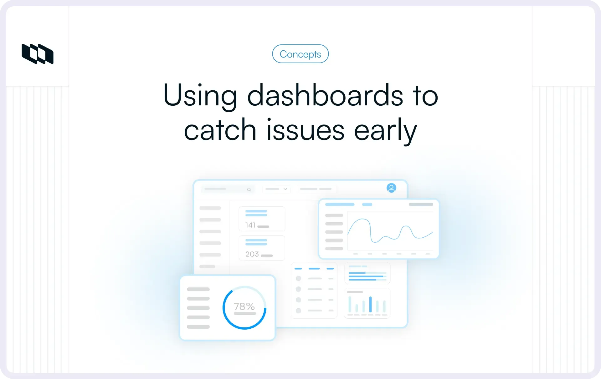
How to create a dashboard that visualizes bottlenecks
A good dashboard makes it easy to see where work is moving and where it is slowing down. It doesn’t show every piece of data. Instead, it highlights the signals that help teams spot pressure points quickly, without digging through multiple tools or reports.
The first rule is clarity. Every chart should answer simple questions about flow:
- Where are tasks piling up?
- How long do they stay in each stage?
- Is throughput steady or fluctuating?
If a chart needs explanation before it becomes useful, it slows teams down.
Use visualizations that highlight flow
1. Cumulative flow diagram (CFD)
A CFD shows how many tasks sit in each stage over time. When a band widens, it means tasks are entering that stage faster than they leave it, often the earliest sign of a bottleneck.
2. Cycle time scatterplot
This chart shows how long tasks take to complete. A tight band means flow is predictable. When the points start drifting upward, it indicates rising variability or slowing work, which usually points to a capacity or clarity issue.
3. Work in progress (WIP) by stage
Visualizing WIP allows teams to see which stage is overloaded. If one stage consistently holds more tasks than others, it’s a clear capacity constraint.
4. Simple status indicators
Basic red–amber–green (RAG) signals can help teams spot stages that need attention. They work best when paired with flow metrics, because they highlight where the issue is but not why it’s happening.
Bring the signals together
The real power comes from combining visuals. If cycle times rise, the CFD band widens, and WIP increases in the same stage, the message is clear: work is slowing down there. Dashboards make this visible long before deadlines are affected, giving teams enough time to respond. A dashboard succeeds when it moves bottleneck detection from a late discovery to early recognition.
How to set thresholds and alerts to identify bottlenecks early
Dashboards become even more powerful when they highlight unusual patterns automatically. Setting simple thresholds helps teams spot friction before it turns into a delay.
1. Define what “normal” looks like
Use baseline trends for cycle time, WIP, and throughput to understand the typical range for your workflow. These baselines make it easier to recognise when something is starting to diverge.
2. Trigger alerts for early warning signs
Configure alerts for:
- WIP spikes in a single stage
- cycle time jumps over a defined threshold
- stalled tasks that haven’t moved for a certain duration
These signals notify the team the moment pressure starts to build.
3. Act before delays spread
Automated alerts reduce reliance on manual monitoring and help teams respond quickly. Instead of discovering bottlenecks during a retrospective or status check, dashboards prompt action while issues are still small and manageable.
How to interpret dashboard signals (patterns to look for)
Dashboards are most useful when you read signals together. Single metrics only show part of the picture, patterns reveal where work is slowing and why. Here are the combinations that matter most.
1. Widening CFD band + rising cycle time
This pattern shows that tasks are entering a stage faster than they’re leaving it. What it means:
- The stage (often “Review” or “QA”) is overloaded
- Capacity is lower than the incoming demand
- Clarity issues or rework may be slowing progress
2. High WIP + dropping throughput
When teams start too much work in parallel, delivery slows. What it means:
- Focus is spread too thin
- Stalled or aging items are blocking the flow
- The team’s completion rate dips even though activity looks high
3. Long wait times
Wait times highlight where work is sitting idle rather than actively progressing. What it means:
- Dependencies are not moving
- Ownership is unclear
- approvals or reviews are slower than usual
4. Cycle time spikes in a single stage
A sudden increase in how long tasks take in one step. What it means:
- The process friction or rework has increased
- Entry or exit criteria aren’t well understood
- A key role may be under-resourced
5. Throughput drops without visible WIP changes
A subtle but important signal that work is slowing behind the scenes. What it means:
- Hidden bottlenecks are forming
- Tasks may bounce between stages
- Work isn’t progressing cleanly through the pipeline
What to do after you identify a bottleneck
Finding a bottleneck is the first step. The next step is understanding why work is slowing in that stage. Most delays are caused by the workflow's structure, not by individual performance, so the focus should be on the process itself.
1. Talk to the people closest to the work
Start at the stage where tasks are piling up. Ask the team what happens typically there and what may be different this time. Common causes often include:
- Unclear or incomplete requirements
- Repetitive rework
- Slow or complex reviews
- Limited availability of a specific role
- Unclear ownership during handoffs
These conversations usually reveal the root cause quickly.
2. Address capacity and flow issues
If the slowdown is due to limited capacity, try redistributing work or adding support where possible. Minor adjustments, like pairing roles, rotating responsibilities, or adding review capacity, can restore flow.
In workflows where tasks tend to stack up, lowering the work-in-progress (WIP) limit can help reduce the backlog. Fewer parallel tasks make it easier to spot issues early and prevent overloading one stage.
3. Fix recurring patterns
If the same bottleneck appears repeatedly, it’s a sign of a structural problem. Examples include:
- A review step that always takes longer than planned
- A manual process that needs automation
- Unclear entry/exit criteria for a stage
- Dependency steps with no defined ownership
Improving these patterns has a longer-term impact than solving one-off delays.
Make bottleneck management continuous: Workloads and priorities shift often. A dashboard helps teams keep track of these changes and catch new bottlenecks before they disrupt delivery. The goal is not to eliminate bottlenecks forever, but to spot and address them quickly as the system evolves.
Conclusion
Bottlenecks rarely appear with a warning. They build quietly as work waits, stages overload, or clarity slips. Dashboards make these slowdowns visible long before they affect delivery. By tracking flow metrics, watching for pattern-based signals, and using alerts to catch early friction, teams can respond quickly and keep work moving smoothly.
The goal isn’t to eliminate bottlenecks; every workflow has natural constraints. Instead, it’s about spotting them early, understanding what’s causing them, and adjusting the process before delays spread. When dashboards become part of the team’s daily rhythm, projects stay more predictable, more stable, and easier to manage at scale.
Frequently asked questions
Q1. What is the 5-second rule for dashboards?
The 5-second rule states that a dashboard should communicate its main message within five seconds. A viewer should instantly understand whether work is on track, where attention is needed, and what the key trends show, without digging through charts.
Q2. What are the four types of dashboards?
The four common types are:
- Operational dashboards: Monitor real-time activity and flow.
- Analytical dashboards: Explore patterns, trends, and bottlenecks.
- Strategic dashboards: Track long-term goals and KPIs.
- Tactical dashboards: Support mid-term planning and team decisions.
Q3. What is a PMO dashboard?
A PMO dashboard gives project management offices a high-level view of project health, resource utilisation, delivery risk, timelines, and portfolio-level performance. It helps leadership track predictability across teams and spot risks early.
Q4. What is a bottleneck in a project?
A bottleneck is a stage in the workflow where tasks pile up because work cannot be processed as quickly as it arrives. Bottlenecks slow overall delivery, increase wait times, and reduce predictability if not addressed early.
Q5. What are the 3 C's of data visualization?
The 3 C’s are:
- Clear: Easy to read and understand
- Concise: Only the essential information is shown
- Consistent: Formatting, colours, and patterns follow the same logic
These principles ensure dashboards communicate insights effectively and quickly.
Recommended for you