Analytics that actually matters in project management
Introduction
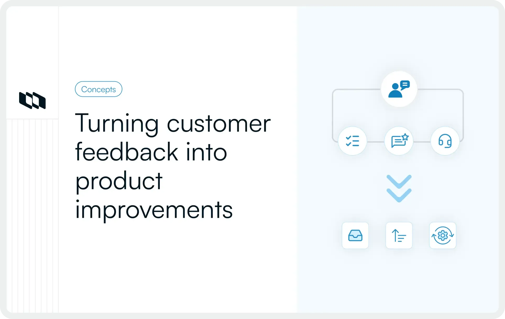
Most project metrics tell you what happened. Very few tell you what’s about to happen. And that’s exactly where most dashboards fall short. Teams rely on numbers that describe the past, not the signals that shape the next sprint, decision, or risk. But the teams that consistently deliver? They read their analytics differently. They look at flow, friction, stability, and value—not just output. They care about health, not just progress.
This guide breaks down the project analytics that give you that advantage: the small, meaningful signals that help you steer your project long before issues turn into delays.
What are project management analytics?
Project management analytics is the practice of using data to understand how work is progressing, why it’s progressing as it is, and what needs attention next. It goes beyond surface-level reporting and focuses on the signals that actually influence delivery—flow patterns, bottlenecks, risks, value, and team health.
Unlike traditional dashboards that simply show counts and charts, analytics helps teams interpret those numbers. It connects activity to meaning. It reveals conditions, not just outcomes. And it gives project managers a clearer way to make decisions rather than react to surprises.
At its core, analytics answers questions like,
1. What’s working smoothly?
2. Where are cracks forming?
3. Are we creating real impact?
4. Is the way we’re working sustainable?
Project management analytics is not about tracking more metrics. It’s about tracking the right ones—the ones that help you steer a project before issues become problems.
Actionable versus vanity metrics in project management analytics
Teams collect a huge amount of data, but not all of it helps them manage delivery. Before we dive into the metrics that matter, it helps to understand the difference between the numbers that look useful and the ones that actually change decisions.
- Vanity metrics are the numbers that look impressive on a project dashboard but reveal almost nothing about project health—things like the number of tasks created, hours logged, meetings held, or total updates posted. They describe activity, not meaning.
- Actionable metrics are different. They show how work is actually flowing: cycle time, bottlenecks, risk exposure, rework, or patterns in delays. These are the signals that shape decisions and sit at the core of project management analytics and project performance metrics.
Most organizations default to vanity metrics because their tools track them by default. They’re easy to collect, easy to display, and easy to misunderstand. But the cost is high: teams get a clean snapshot without any insight into what’s about to break.
Actionable metrics shift the focus from reporting progress to understanding it. And that’s where meaningful project analytics truly begins.
Understanding leading and lagging Indicators
Before selecting which project management metrics to monitor, it is essential to understand the two primary types of signals that every project generates: leading and lagging indicators. Many teams unintentionally focus on one type—typically lagging indicators—while neglecting the other. As a result, their dashboards tend to describe what has occurred rather than diagnose the underlying causes or predict future challenges.
What are lagging indicators?
Lagging indicators measure outcomes that become visible only after work has been completed. These metrics reflect results such as cost overruns, missed deadlines, scope delivery, or defect reports. While they are critical for governance and retrospective evaluation, lagging indicators provide limited opportunity for intervention, as the project has already absorbed their associated impacts.
Examples of lagging indicators include:
- Budget variance
- Schedule adherence
- Scope completion
- Defect count after release
Application: Lagging indicators are valuable for validating whether the project has met its predefined expectations. However, they rarely take corrective action in real time, as they assess performance only after the fact.
What are leading indicators?
Leading indicators measure current conditions likely to influence future project outcomes. These metrics can reveal early signs of instability, inefficiency, or risk, thereby offering actionable insights during project execution rather than after its completion.
Examples of leading indicators include:
- Increases in cycle time
- Rising number of unresolved blockers
- Dependency wait times
- Rework frequency or repeated scope changes
- Trends in risk exposure
Application: Leading indicators provide insight into a project's direction. By tracking these early signals, project teams can make timely adjustments to scope, capacity, task sequencing, or risk management strategies before delays or disruptions occur.
Why both matter
A comprehensive and practical analytics framework requires the integration of both indicator types:
- Lagging indicators validate what has already occurred.
- Leading indicators explain why those outcomes occurred and identify where intervention is needed next.
Teams that actively monitor both forms of data are better equipped to anticipate risks, prevent avoidable setbacks, and maintain a stable delivery cadence. This dual approach lies at the core of modern project analytics, especially when organizations seek to move beyond static reporting and toward proactive, evidence-based decision-making.
Metrics that improve predictability and delivery flow
Predictability in projects isn’t about speed — it’s about stability. Teams that deliver consistently don’t rely on gut feel or colourful status reports. They use a small set of flow-focused project management metrics that show whether work is moving smoothly through the system. These metrics help answer the most fundamental delivery question: Are we on track?
Below are the metrics that matter most for predicting flow, spotting friction early, and improving planning accuracy.
1. Cycle time
Cycle time measures how long a work item takes once the team starts working on it.
What it tells you,
- Rising cycle times - hidden friction, unclear requirements, or inconsistent prioritisation
- Stable cycle times - reliable delivery patterns (useful for forecasting)
Why it matters: It’s one of the most reliable metrics that matter in project management because it exposes actual execution reality — not planned intent.
2. Lead time
Lead time captures how long a request takes from the moment it’s raised to the moment it’s delivered.
What it tells you,
- How long do customers/stakeholders actually wait
- Whether your intake process, refinement, or approvals are slowing down delivery
Why it matters: Lead time connects delivery performance to stakeholder experience — the heart of project performance metrics.
3. Cumulative flow diagram (CFD)
The CFD shows how work flows through your workflow.
What it tells you:
- Where work is piling up (bottlenecks)
- Whether the work-in-progress (WIP) is increasing faster than completion
- Whether the flow is stable or volatile
Why it matters: A stable CFD is one of the strongest signals of healthy flow. Volatility is an early warning sign long before deadlines slip.
4. Throughput
Throughput measures how many work items the team completes in a given time period.
What it tells you:
- Your real delivery capacity
- Variability in performance across sprints/weeks
- How predictable your team actually is
Why it matters: Reliable throughput leads to accurate capacity planning — the foundation of meaningful project management analytics for teams.
Why these metrics matter for predictability
When viewed together, cycle time, lead time, CFD, and throughput offer a complete picture of delivery flow. They reveal:
- How smoothly does work move
- Where delays form
- Whether your team can meet commitments
- How reliably can you forecast future delivery
This is the core of project analytics: using data to understand conditions, not just results.
Metrics that show value and outcomes
Delivery speed matters little if the outcomes don’t. This category focuses on metrics that help teams understand whether the work aligns with business priorities, customer needs, and strategic goals. These analytics translate “output” into “impact,” helping PMs guide conversations around trade-offs, prioritization, and timing.
Metric 1: Business value delivered
Business value delivered measures the strategic impact of completed work. Teams assign a simple value score to each deliverable—based on revenue potential, cost savings, customer retention, or alignment with strategic priorities.
Why this matters:
- It shifts discussions from “how much did we do?” to “what difference did it make?”
- It makes prioritization more objective, especially when stakeholders push low-impact requests.
- It helps teams justify decisions when delivery capacity is limited.
Example: A feature that automates a manual process and saves 200 hours per month carries high operational value. A customer-facing enhancement that improves activation by 5% carries high revenue value. Even if they differ in effort, their business value score may be comparable.
Metric 2: Cost of delay (CoD)
The cost of delay quantifies the value lost when work is postponed. It’s one of the most potent ways to prioritize because it forces teams to consider when a feature is needed, not just what it requires.
Why this matters:
- It surfaces urgency backed by numbers, not opinions.
- It reveals which work items create disproportionate loss when delayed.
- It encourages continuous re-evaluation of priorities as conditions change.
Example: A compliance requirement delayed by a quarter could lead to penalties of $500,000. A delay in a retention feature might cost $50,000 per month in churn. CoD makes these trade-offs visible and measurable.
Metrics that reveal team and process health
Even when delivery looks predictable and value alignment is strong, a project can still struggle if the underlying way of working is unhealthy. Issues like unclear requirements, rushed reviews, inconsistent quality, or hidden technical debt rarely appear in typical dashboards. But they show up early in the data—long before they show up in missed deadlines or frustrated stakeholders.
This category focuses on the project management metrics that highlight internal friction: the parts of the workflow that slow teams down, reduce quality, or compromise long-term delivery stability.
1. Rework rate
Rework rate measures how often completed work needs to be redone. A rising rework trend is one of the strongest indicators of deeper issues, such as:
- Unclear or shifting requirements
- Missed edge cases
- Misalignment between stakeholders and the delivery team
- Gaps in review or testing practices
Why this matters: High rework doesn’t only waste time—it quietly erodes capacity. The team spends more time fixing past work than progressing new work, reducing predictability and increasing delivery stress.
Example: If 25% of completed user stories need revisions during QA, the issue isn’t QA—it’s unclear requirements or a mismatched understanding upstream.
2. Escaped defects
Escaped defects are issues discovered after release. This metric highlights gaps that slipped through the team’s review, testing, or validation.
Common root causes include:
- Insufficient test coverage
- Incomplete acceptance criteria
- Rushed development cycles
- Dependency misalignment
Why this matters: Escaped defects increase support load, damage stakeholder confidence, and introduce hidden rework that often hits when the team is already planning the next sprint or milestone.
Example: If two major defects appear in production every sprint, the problem isn’t just fixing bugs—it’s assessing upstream workflow discipline.
What these metrics tell you
Together, rework rate and escaped defects give a clear picture of:
- Whether the team is aligned on what to build
- Whether quality practices are consistent
- Whether the workflow supports sustainable delivery
They serve as early alerts that something is breaking beneath the surface—even if velocity, cycle time, or throughput still look normal. These project performance metrics help you address root causes before they turn into schedule risk or delivery instability.
How to build a focused project analytics dashboard
A project dashboard should do one thing exceptionally well: make decisions easier. Not by showing more charts, but by highlighting the few signals that reflect delivery health, value, and stability. This section lays out a simple, practical way to build a dashboard that teams actually use, and leaders actually trust.
1. Start with one defining question
Every project has one core question that determines whether the work is on track. Before choosing metrics, clarify what the question is.
Examples:
- For a time-sensitive project: “Can we deliver this by the target date?”
- For a customer-impact initiative: “Are we improving the outcome we committed to?”
- For a reliability project: “Are we reducing risk and operational strain?”
Your dashboard should exist to answer only this question. Everything else becomes noise.
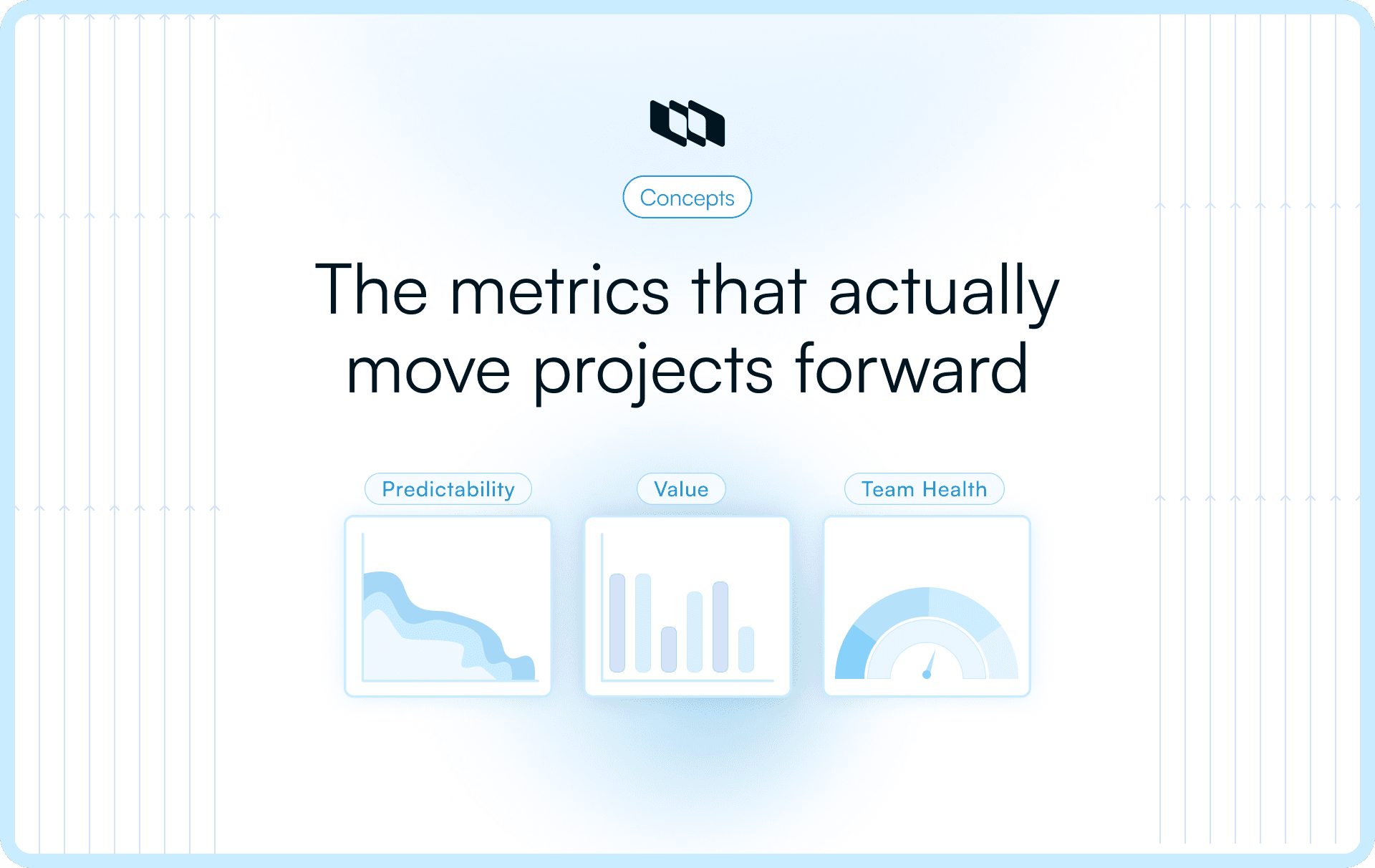
2. Choose your ‘power trio’ of metrics
A focused dashboard uses one metric from each of the three essential dimensions of project management analytics. This gives a balanced view of delivery conditions without overwhelming teams.
- Predictability metric: Shows how reliably work moves (e.g., cycle time, throughput).
- Value metric: Shows whether outcomes match the effort (e.g., business value delivered, cost of delay).
- Team or risk metric: Shows whether the way of working is stable (e.g., rework rate, escaped defects, blocker aging).
Selecting these three keeps the dashboard tight, actionable, and aligned with what leaders actually want to understand.
3. Visualize clearly, review consistently, and adapt as work evolves
Dashboards are not presentations—they are decision tools. Keep visuals simple and choose formats that make patterns obvious.
Examples:
- A trend line for cycle time
- A cumulative flow diagram for flow stability
- A score or bar trend for value delivered
Build a review rhythm (weekly for delivery teams, fortnightly for leadership). As priorities change, update the metric set—retire metrics that no longer inform decisions and introduce new ones that reflect the project’s current stage.
A good dashboard evolves with the project, not with the reporting template.
Conclusion
Great projects don’t succeed because teams track more numbers. They succeed because they track the right ones—the metrics that reveal conditions, not just outcomes. When you shift from vanity numbers to project management analytics, you gain a clearer view of flow, value, and risk, and you make decisions based on evidence rather than assumptions.
A focused approach to project analytics helps teams forecast delivery earlier, correct issues before they escalate, and build work that aligns with business outcomes. And as projects evolve, the metrics you track should evolve with them. The goal isn’t to build perfect dashboards—it’s to build the kind of understanding that makes delivery predictable, outcomes meaningful, and teams confident in their direction.
Frequently asked questions
Q1. What is project management analytics?
Project management analytics is the practice of using meaningful data to understand how work is progressing, why certain patterns emerge, and where corrective action is needed. Instead of tracking surface-level activity, it focuses on flow, predictability, value, risk, and team health to guide better decisions.
Q2. What are the 4 types of analytics?
The four common types of analytics used across industries are:
- Descriptive analytics – explains what happened.
- Diagnostic analytics – explains why it happened.
- Predictive analytics – forecasts what is likely to happen next.
- Prescriptive analytics – recommends the best course of action.
These map closely to how project management metrics evolve from reporting → insight → prediction → action.
Q3. What are the 7 stages of project management?
Most project frameworks outline these seven stages:
- Initiation
- Planning
- Scope definition
- Resource & risk planning
- Execution
- Monitoring & controlling
- Closure
Analytics play the strongest role in stages 4, 5, and 6, where clarity, forecasting, and decisions impact delivery.
Q4. What are the 5 C’s of data analytics?
The widely referenced 5 C’s are:
- Cleanliness – ensuring high-quality data
- Completeness – capturing all relevant inputs
- Consistency – standardizing how data is measured
- Context – interpreting data correctly
- Credibility – ensuring accuracy and trust
These principles improve how project performance metrics are applied.
Q5. What are the 7 C’s of project management?
The 7 C’s that guide strong project delivery are:
- Clarity
- Collaboration
- Communication
- Commitment
- Consistency
- Competence
- Control
When paired with meaningful project management analytics for teams, these create a foundation for predictable, outcome-driven delivery.
Recommended for you