Meet the new work item detail page
The work item detail page is where work actually happens. We built it to match that, more organized, more navigable, and ready for everything coming next.
The work item detail page is where work actually happens. We built it to match that, more organized, more navigable, and ready for everything coming next.
The work item detail page is the most visited surface in Plane. It's where you read context, update properties, leave comments, track time, and close things out. Every other view in the product, Boards, Lists, Spreadsheets, Cycles, is a way to organize work items. The detail page is where you actually do the work.
When we first shipped it, there weren't that many things on it. A handful of properties, a description, an activity feed, and some action buttons. The design made sense for that scope. Over the past couple of years, two things happened. The product stack expanded: we added custom properties, relations, dependencies, links, attachments, pages, worklogs, and more. And the way teams use Plane evolved: workflows got more complex, property counts grew, and the detail page became a heavier surface than it was designed to be. The page kept absorbing new things, but the layout stayed the same.
So we redesigned it. Here's what changed.
What we were working with
The original detail page put every property in a single flat list on the right pane. State, priority, assignee, due date, and your custom properties all lived at the same level. That works fine when you have seven properties. When teams start adding their own (bug type, severity, discovered-in-version, target release), you end up with a long scroll where every field looks equally important and none of them stand out.
The action buttons had a similar story. We started with one: add sub-work item. Over time we added add relation, add link, attach, add page. Each one got its own button in a horizontal row. The row kept getting wider.
The activity area was one continuous feed. Comments, property changes, worklog entries, all in a single stream. There was a filter option, but it was a small icon button that most people never noticed.
None of this was a problem with the original design. The product just outgrew it.
How we got here
Community requests told us what was frustrating. Users asked for better property organization, filtered activity views, and ways to reduce scroll on heavy work items. Qualitative research sessions showed us where people hesitated, backtracked, or gave up. Heuristic evaluations across the page surfaced structural issues that individual feedback wouldn't catch on its own: inconsistent grouping, buried affordances, mismatched information hierarchy.
Product telemetry gave us the numbers behind those patterns. We could see which properties were edited most frequently, which action buttons were actually clicked, and how rarely the activity filter was used. That data shaped specific decisions throughout the redesign.
From there, we prototyped, tested with small user groups, ran A/B tests on key changes, and iterated before shipping anything broadly. What you see today has been through multiple rounds of validation.
The principle behind the redesign
Group what belongs together. Promote what matters most. Collapse what can wait. That's what guided every decision below.
What changed
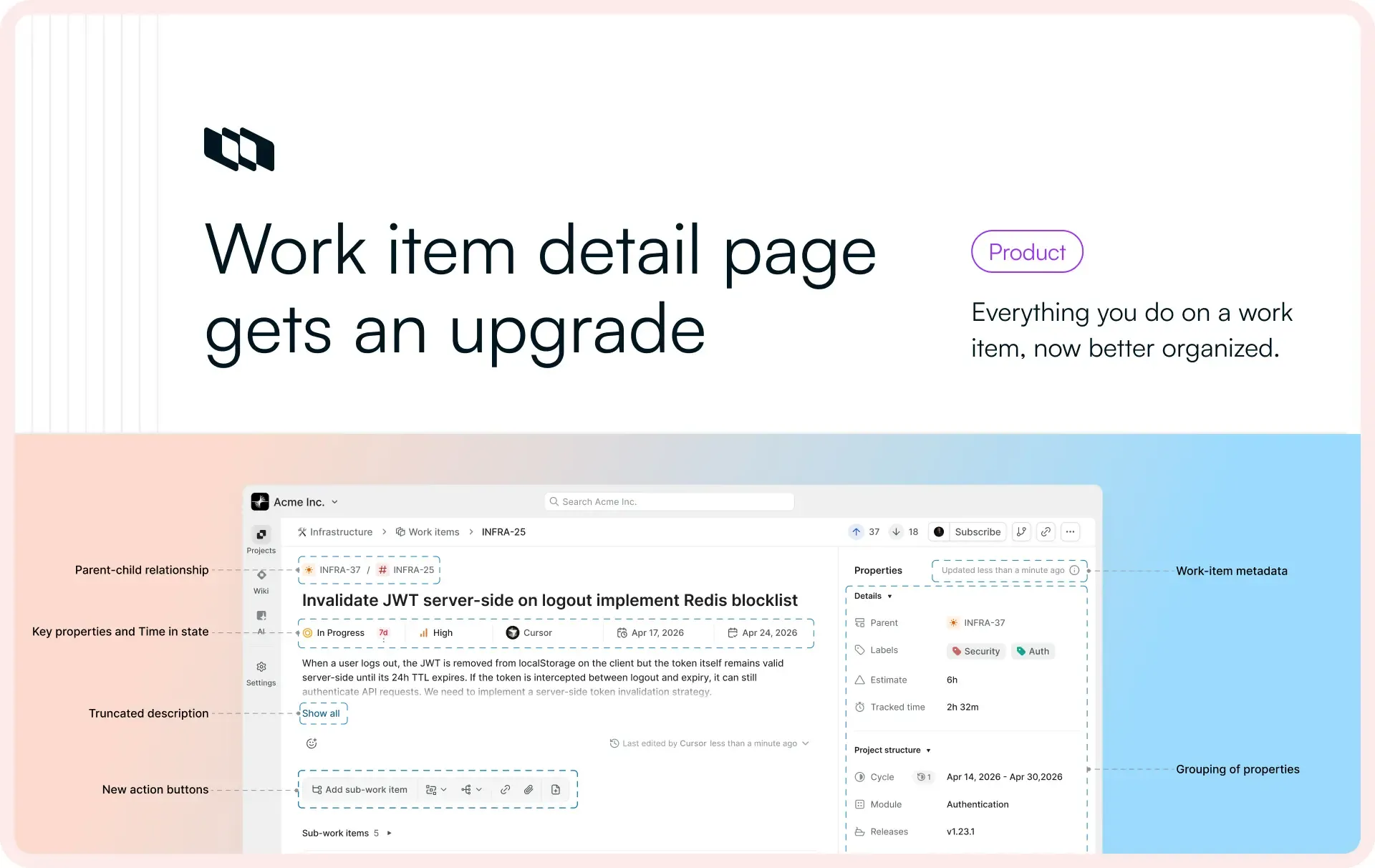
Work item header
The work item type used to show as just an icon. Now the type name appears next to the icon, truncated at around 12 characters with a tooltip for the full label. The parent relationship, which was previously a property in the right pane, now shows as a pill next to the work item ID. You can immediately tell whether you're looking at a parent or a child without scrolling.
Key properties, moved to the center
State, Priority, Assignee, Start date, and Due date are no longer in the right-side properties pane. They now sit in the center column, right below the title. Telemetry confirmed what we expected: these are the fields edited most frequently across workspaces. Putting them front and center means you do not have to scan a list to find them.
We also introduced time in state here, a new property that shows how long a work item has been in its current state.
Properties, now grouped
We introduced three collapsible sections in the properties pane:
- Details: Labels, Estimate, Tracked time
- Project structure: Cycle, Module, Releases, Milestones, Customers
- Custom properties: anything your workspace has defined
Previously, all of these lived in the same flat list with no categorization. In research sessions, we watched users scroll up and down the properties pane looking for a specific field, often passing it more than once. Grouping by category and making sections collapsible cuts that down significantly.
Static metadata, moved to the footer
Created by, created on, updated on, and completed on are fields you can't edit. They update based on activity. In the old design, "created by" sat in the properties list alongside editable fields. That didn't make sense. These are reference information, not things you interact with.
They now live in a compact row at the bottom of the properties pane, with full details available on hover via tooltips.
Description, now truncated
Our editor supports headings, images, file embeds, code blocks. Descriptions can get long. Previously, the entire description rendered inline regardless of length. In user research sessions, we consistently saw people scrolling past long descriptions to reach comments, sometimes losing their place in the process.
Now, descriptions longer than about seven lines truncate with a "show more" option. One click to expand.
Action buttons, cleaned up
The horizontal row of text buttons is gone. Sub-work-item gets a proper labeled button since it's the most commonly used action. Everything else (dependencies, relations, links, attachments, pages) is now an icon button, grouped by type.
We initially explored a floating action button and got as far as a working prototype. Everyone liked it, but it was a bigger departure than we needed for this iteration. The icon button approach gives us the scalability without changing the interaction pattern people are used to.
Activity, now tabbed
This is the biggest change on the page. The activity area is now split into five tabs:
- All: comments, property changes, worklogs, and transitions in one feed
- Comments: just the conversation
- History: property changes showing what the value was before and what it changed to
- Transitions: state changes only, with time in state shown for each transition
- Worklogs: time tracking entries
History and Transitions are new views. Previously, property changes showed up in the activity feed but without the before/after diff. If you wanted to know what a field used to be, you had to piece it together. Now each change shows the previous value and the new value side by side.
We considered keeping the single-stream approach and adding a toggle for the diff view. But telemetry showed that the existing activity filter had very low usage. The capability was there; people just weren't finding it. Tabs make the views visible. You see that History exists, you click it, you get what you need. This was also one of the more common community requests we received. For teams coming from Jira Data Center, this layout is familiar too, which matters during migration.
Why this matters for what's coming
Individually, each of these changes is incremental. Together, they change what the detail page can hold. A work item with a hundred custom properties is now navigable. Activity history is readable without scrolling past noise. The page has headroom.
That headroom is the point. The features shipping over the rest of this week build on this page. Time-in-state analytics, new relation types, richer connections. They need a surface that can support them. Today's redesign is that surface.
And we're not done with this. The grouped properties pane sets up two things we're working toward. First, custom property grouping: right now properties are organized into Details, Project structure, and Custom properties. Going forward, you'll be able to create your own groups within custom properties, so teams with dozens of fields can organize them in a way that matches how they think about their work. Second, a customizable detail view: the ability for individual users to configure what their work item detail page looks like based on their own workflows. Different roles care about different information. The page will reflect that.
Recommended for you

 Download for Mac
 Download for Android