Introducing brand new Progress Charts
Brand new Progress Charts to give you the essentials at a glance and let you dive in for details
Brand new Progress Charts to give you the essentials at a glance and let you dive in for details
One of the most loved things about Plane are its Progress Charts, intuitively available where you most need them. You find them in Cycles, Active Cycles, Modules, and Home. However, so far, they were inconsistent in look-and-feel and didn’t answer some top-of-the-mind questions like how far behind you were trailing in a particular cycle.
That’s changing starting today.
Progress Charts in Cycles
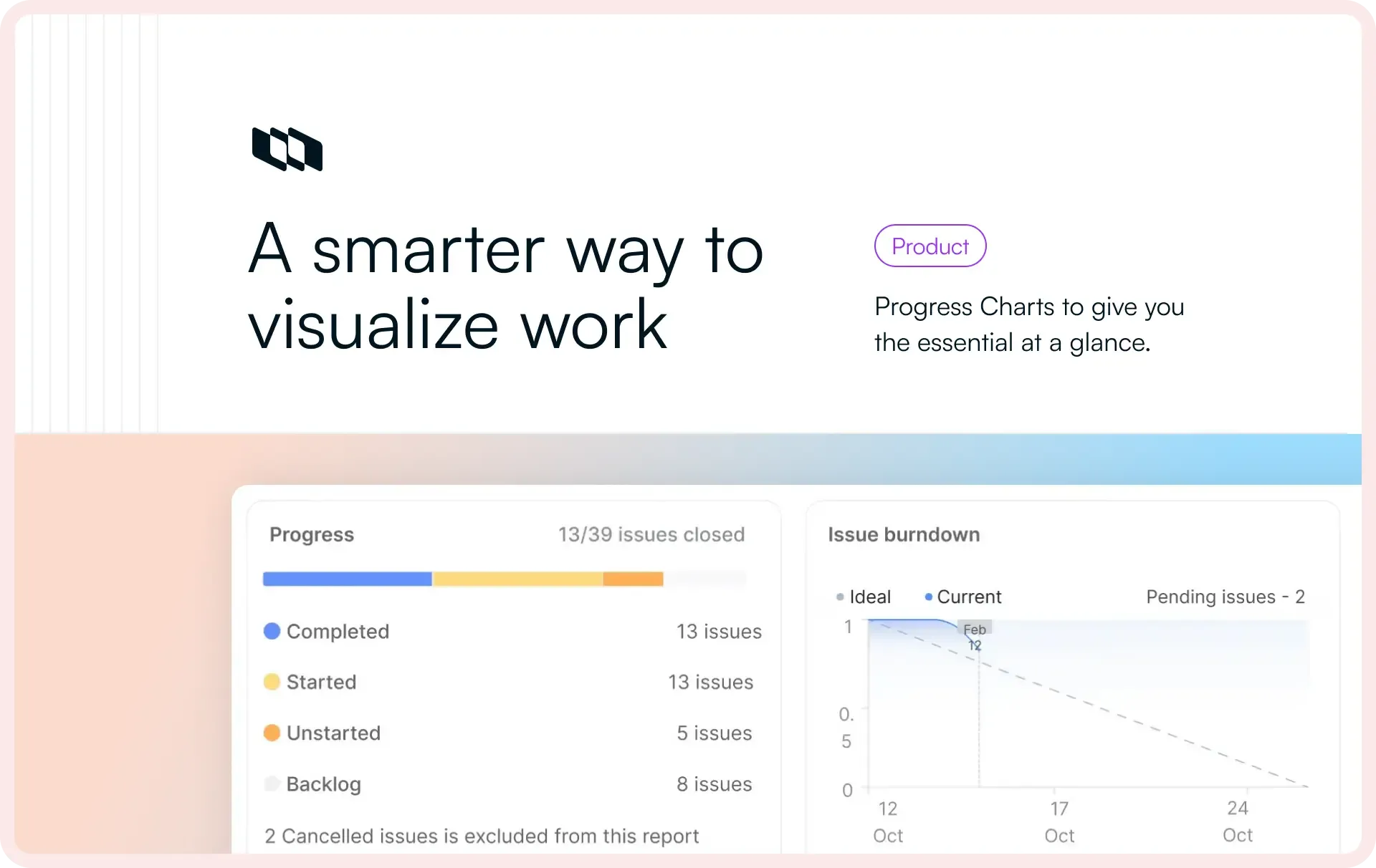
Arguably, the most useful bit about Cycles are the three widgets on the Overview.
You quickly see how your cycle’s progressing, the state that has the bulk of your work, and how project members are doing. Good, but not great.
Starting today, you will see ↓ if you are on Pro on our Cloud and self-hosted Plane.
Pretty and immediately useful, these charts now come packed with the easiest ways to get answers.
- Click the completion circle at the top-left and you can cycle through the number of issues by state.
- Hover of the state group names on the left to see your chart show progress for any of those stategroups.
- Hover over Scope and you will quickly find the percentage of scope creep by the day it crept up.
- Hover on any point on the chart and you see essential progress metric by the day in the cycle while the persistent blue line indicates how scope changed.
We also wanted our lens on flexibility with these spate of changes so Plane could become more useful for non-software teams.
With Issue Types, Plane already extends its usability to non-software teams. You can now shape your work for your team or type of company with custom props by issue type. Try it.
With the new Progress Charts, you can now choose between Burn-down and Build-up views and track progress like it works best for your team.
Look to your left and you will see the hard-to-miss Trailiing by X issues.
Combined with Ideal done in blue and Beyond time in red on the chart, it’s designed to help you make changes to get a trailing cycle back on track.
Clicking any stategroup, instead of just hovering over it, filters the cycle by that state—awesome when want to drill down into the issues of just one stategroup.
Finally, in keeping the goodness of the previous progress charts, the More details pane still shows you your cycle’s description and participation, but some things like Copy link are now neatly tucked away. Similarly, the mini-me in the pane is still familiar, but shows the new chart layout.
What’s next
This is just the beginning for our new progress charts. We chose Cycles for the first iterations because they are the most popular progress driver in Plane—X cycles created from Plane’s inception—, but soon, they will evolve to cover Modules, Home, our new Dashboards, and even the main Analytics console.
Reach out to us on Twitter or Discord, let us know how you like these charts, and tell us what’s missing. We read everything you write anywhere and will take all your feedback on our way to Plane 2.0.
Recommended for you